
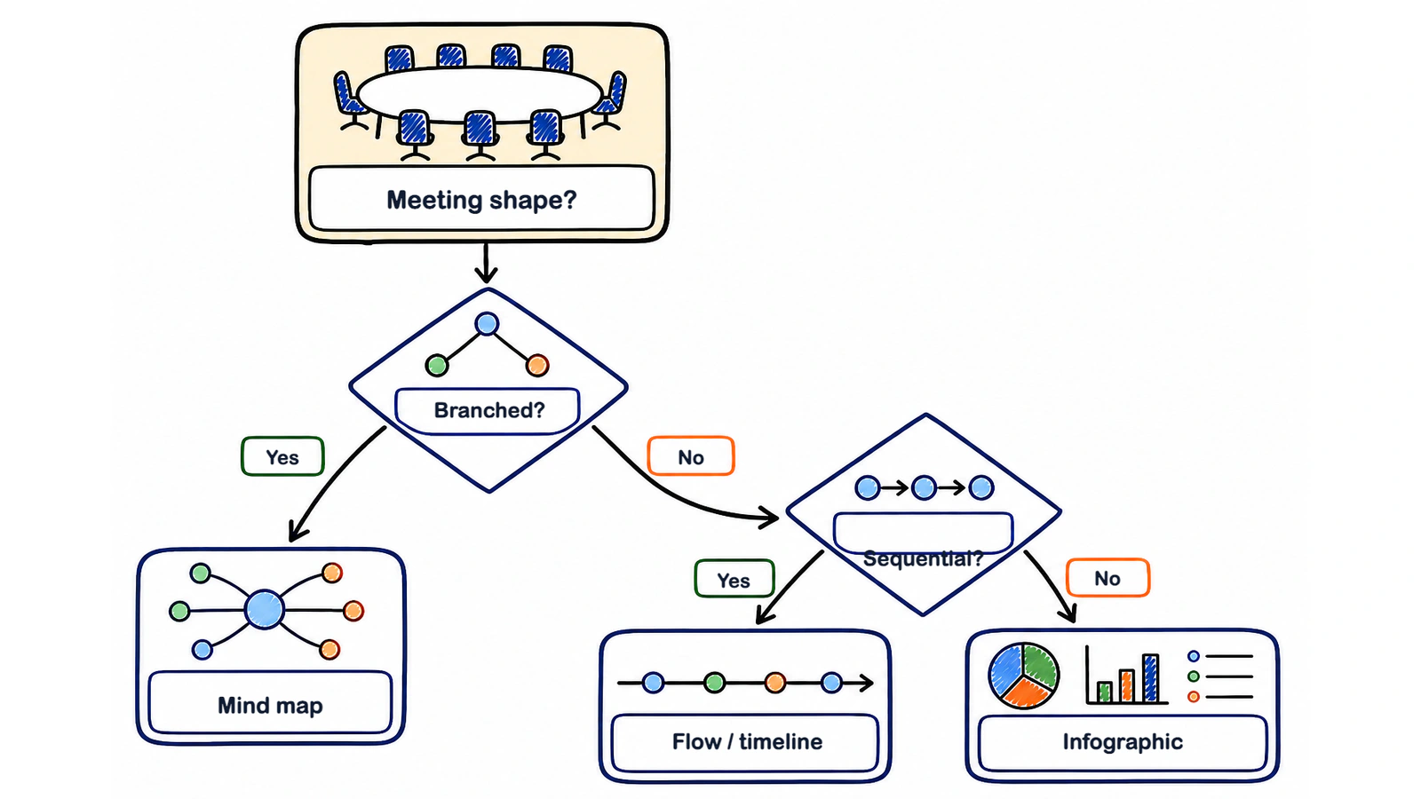
Use a mind map when a meeting branched into topics, a flow or timeline when it moved through stages or trade-offs, and an infographic when people need one glance to remember what was agreed — below are 12 common meetings and the visual that fits each.
The visual should follow the conversation's shape, not the meeting's calendar label. A project meeting that jumps among workstreams needs a different recap from one that spends 40 minutes settling a delivery sequence. Start by asking what relationship matters: branches, movement, or the final picture.
Keep the visual deliberately incomplete. Exact wording, objections, owners, due dates, and sensitive context belong in the written summary and transcript. The picture is the fast route back into the meeting, not the whole record.
If you can name the relationship the reader needs to see, the right format becomes clear.
What are the three shapes a meeting visual can take?
The three useful shapes are a mind map, an infographic, and a flow or timeline; each makes a different relationship easy to see and hides something else.
| Format | What it shows well | What it hides | Typical meetings | Example image |
|---|---|---|---|---|
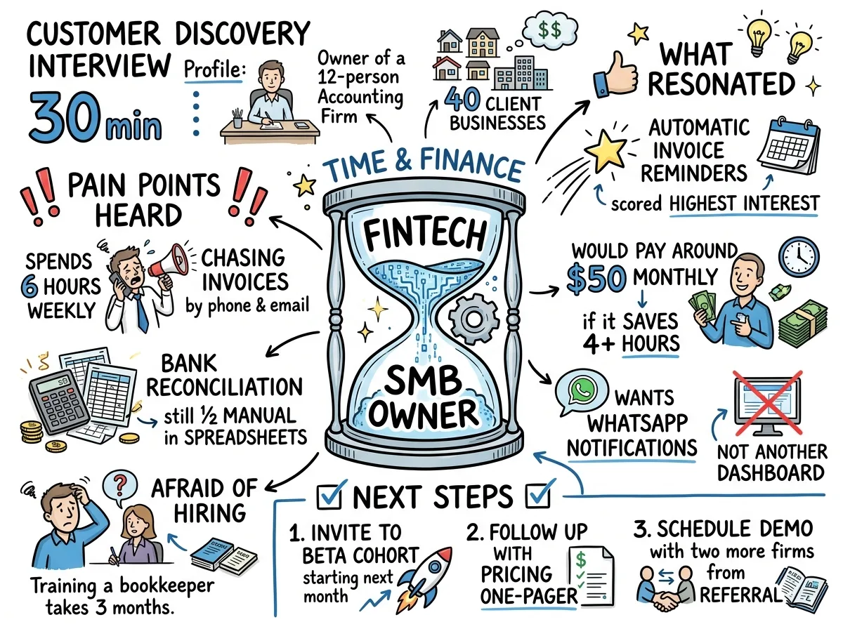
| Mind map | Topics, subtopics, workstreams, and how ideas cluster | Speaking order, exact sequence, and long caveats | Discovery calls, design reviews, workshops | A central topic with labelled branches |
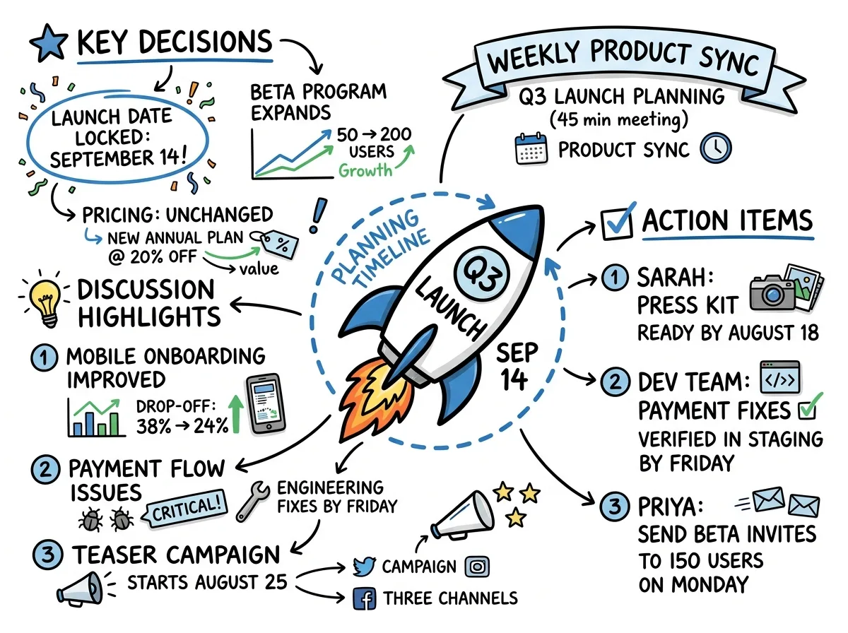
| Infographic | Decisions, key numbers, themes, owners, and the one-page outcome | Debate history, dependencies, and detailed exceptions | Stand-ups, all-hands, retrospectives | A scan-friendly page with clear regions |
| Flow or timeline | Stages, handoffs, trade-offs, approvals, and what happens next | Side discussions and themes that do not fit the path | Planning, negotiation, contract review | A left-to-right path with decision points |
MindMeister's manual meeting method starts with one branch per agenda item. Notta's visual-summary guides treat an infographic as a different artifact: selected points arranged for a quick read. Those approaches point to the same rule. A map groups; an infographic prioritizes; a flow orders.
How do I choose the format?
Ask whether the meeting branched, moved, or landed; the first honest yes selects the visual.
- Did it branch into topics or workstreams? Use a mind map.
- Did it move through steps, dependencies, positions, or trade-offs? Use a flow diagram or timeline.
- Do people mainly need to remember the outcome? Use an infographic.
If 2 answers feel equally true, decide who will open the recap. The delivery team may need the timeline, while a sponsor needs the outcome infographic. Two visuals are justified only when they answer different questions.
Which visual fits each of 12 common meetings?
The right format is the one that exposes the meeting's working relationship while leaving precise records in text.
1. What should a daily stand-up become?
Use a compact infographic or decision list for a daily stand-up. Show each person's current priority, blocker, owner, and immediate handoff in separate regions. Keep explanations, technical detail, and anything that needs investigation in the written summary.
A stand-up should not become a sprawling map just because several people spoke. The useful relationship is status at a glance. If nothing changed and no blocker appeared, the text recap may be enough.
2. What should sprint planning become?
Use a timeline when sprint planning produces a sequence; use a mind map when it mainly divides work into streams. The visual should show milestones, dependencies, ownership boundaries, and the order in which blocked work can move. Keep estimates, acceptance details, and dissent about scope in text.
For an investor update, a timeline might run from closing the metrics, to reconciling the forecast, approving the narrative, and rehearsing the presentation. Show only steps the team actually agreed; leave an unconfirmed dependency open rather than inventing a cleaner sequence.
3. What should a design review become?
Use a mind map for a design review with several surfaces, user needs, or critique themes. Put the object under review in the center, then branch into what works, what changes, open questions, and owners. Keep pixel-level feedback, quoted objections, and approval conditions in the summary.
If the review follows one user journey from entry to completion, switch to a flow. The meeting's path matters more than the word “design.”
4. What should a client discovery call become?
Use a mind map for a client discovery call because the conversation usually branches across goals, current process, constraints, people, and success criteria. Show those clusters and their links. Keep exact client wording, commercial sensitivities, and unconfirmed assumptions in the transcript or summary.
The visual is most useful when it separates what the client said from what your team inferred. Do not turn a hunch into a coloured fact box.
5. What should a vendor negotiation become?
Use a flow diagram for a vendor negotiation. Show positions, concessions, decision points, dependencies, and the resulting agreement as a path. Keep exact contractual language, rejected terms, legal advice, and unresolved clauses in the written record.
For a supplier renewal, the flow can show the opening position, a revised service level, legal review, and the approval gate. It should stop at any unresolved clause rather than drawing a line to an agreement that has not been signed.
6. What should a budget or pricing review become?
Use an infographic when the meeting compares a small set of figures and ends with a decision; use a flow when approval moves through thresholds or scenarios. Show the major buckets, variance, chosen direction, owner, and next review date. Keep formulas, source sheets, assumptions, and exceptions in text or the spreadsheet.
A pricing review usually needs options and the chosen direction; a quarterly budget review needs categories, variance, and the owner of each correction. If the source sheet is restricted, show the decision structure without copying confidential figures into the visual.
7. What should a hiring debrief become?
Use a structured infographic for a hiring debrief. Give each agreed criterion a region, then show evidence themes, unresolved questions, the decision, and the next owner. Keep interview quotes, protected information, individual scorecards, and sensitive disagreements in restricted text.
For a hiring panel spread across offices, use one shared view of the agreed criteria and decision status. Do not include protected information or attributed interviewer comments in the visual. Access control matters more here than decorative polish.
8. What should a board or committee meeting become?
Use a decision-and-timeline infographic for a board or committee meeting. Show agenda themes, formal decisions, accountable owners, and upcoming dates. Keep motions, votes, exact resolutions, conflicts, legal language, and approved minutes in the official written record.
For a board committee reviewing a contract, the visual can show which decision belongs to the committee, which condition goes back to legal, and when the paper returns. It can orient readers; it cannot become the signed agreement or approved minutes.
9. What should an all-hands become?
Use an infographic for an all-hands. Lead with the main message, then group business updates, decisions, recognition, and what employees need to do next. Keep detailed Q&A, caveats, and policy language in the summary.
For an economic or policy briefing, use a clear hierarchy of headline, supporting evidence, implications, and the action employees need to take. Keep source dates beside changing figures and leave policy wording in the written record.
10. What should a retrospective become?
Use a themed infographic for a retrospective, with clear regions for what helped, what hurt, what was learned, and what changes next. A small flow can connect a recurring cause to an agreed experiment. Keep personal comments, minority views, and the reasoning behind sensitive feedback in text.
For a regional campaign retrospective, the period and campaign provide the frame. Group evidence under what helped, what hurt, and the next experiment, but link performance figures to the approved dashboard rather than copying or fabricating them.
11. What should a 1:1 become?
Use a private mind map only when a 1:1 genuinely branches across goals, support, feedback, and follow-up. Put the relationship or period at the center and keep the branches sparse. Sensitive feedback, health information, compensation, and exact commitments belong in a restricted text record.
Often the better answer is no shareable visual. A one-to-one conversation can lose trust when nuance becomes a poster. The participant's expectations and the company's retention rules come first.
12. What should a workshop or training session become?
Use a mind map for the ideas and a timeline for the exercise sequence or rollout. Show the core concept, supporting branches, practice steps, and what participants should do afterward. Keep full instructions, references, and questions in the written material.
A new-hire onboarding workshop spanning two offices naturally suggests both views: a topic map for orientation and a timeline for the onboarding path. Give each view one job instead of squeezing both structures into one crowded page.
What makes a meeting visual readable?
A readable meeting visual makes the decision primary, gives every region one idea, names owners and dates, and removes decoration that competes with the message.
Richard Mayer's Multimedia Learning describes a coherence principle: people learn more deeply from words with relevant pictures when extra decorative material is removed. Applied to a meeting recap, that means an icon should explain a category or relationship. If it merely fills a gap, cut it.
Concept maps have a real research base, but the result needs careful wording. Schroeder and colleagues combined 142 effect sizes from 11,814 participants and found a moderate overall learning benefit, g = 0.58. Constructing maps produced a larger effect than studying completed maps. That is evidence for the value of organizing relationships; it is not proof that every automatically generated meeting visual improves memory.
Use this editing pass:
- Make the decision or main outcome the most visually prominent element.
- Give each region one idea and one clear label.
- Put an owner beside an action and a date beside a deadline.
- Remove repeated context, decorative statistics, and icons with no meaning.
- Check the visual against the summary before sharing it.
How do I get the right format automatically?
Meeting.ai creates a Visual Note from the meeting alongside a searchable, time-stamped transcript and an AI-Powered Summary, so you can scan the visual and return to the source when a detail matters.
You can record In-person from the browser or mobile app, send the Meeting Bot to Google Meet, Zoom, or Microsoft Teams, or upload audio, video, or a YouTube link. Once the meeting is processed, the three outputs have different jobs: transcript for the source, summary for precise follow-up, Visual Note for the shape.
When a meeting changes shape halfway through, no single picture should pretend otherwise. Use the visual as the entry point, then keep the second structure in the summary or in a separate view if one is available. Check the Visual Notes documentation for the current product workflow.
When should I skip the visual entirely?
Skip the visual when it adds interpretation without helping anyone act, especially for a 2-minute check-in, a confidential 1:1, or a legal or HR record that depends on exact language.
For a tiny check-in, a visual may take longer to decode than a sentence. For a sensitive conversation, an attractive card can travel farther than intended. For legal, HR, board, and contract work, a visual can orient the reader but must never replace the controlled written record.
Meeting.ai still gives you the transcript and AI-Powered Summary. Use those as the working record, apply the right access controls, and treat any Visual Note as optional reading. The format earns its place only when it makes a real relationship easier to see.