
The claim that people remember 65% of what they see but only 10% of what they read comes from a 2008 popular-science book, not from an experiment you can cite — the underlying effect is real, but the numbers are not, and this page sorts the visual-memory claims you'll meet into real, overstated, and myth, with the original studies.
Pictures can be easier to recognise than equivalent words. Drawing something yourself can strengthen recall. Building a concept map can help you organise and retrieve what you learned. Those are separate findings, measured with different tasks. None says that everyone is a visual learner or that adding an infographic makes a meeting 6 times more memorable.
For meeting notes, the defensible approach is simple: keep a searchable written record, add one relevant visual cue, and revisit the result while the meeting is still fresh. Meeting.ai supports that combination with a time-stamped transcript, an AI-Powered Summary, and a Visual Note. The Visual Note is a map of the conversation, not a replacement for the words people actually said.
Use a visual as a retrieval cue, without promising a universal memory percentage.
Where do the famous visual-memory numbers come from?
Most famous visual-memory numbers come from uncited teaching charts, advertising copy, or a real result stretched beyond the task that researchers tested.
| Claim | Traceable origin | Verdict | What you can say instead |
|---|---|---|---|
| “After 3 days, people remember 65% with a picture and 10% without one” | John Medina's Brain Rules (2008) repeats the figures without identifying the experiment | Overstated | Pictures often beat equivalent words in item-memory tests; there is no universal 65% versus 10% result |
| “65% of people are visual learners” | William Bradford's 2004 teaching article states 65% without citing a population survey | Myth | People have format preferences, but a fixed visual-learner type does not predict the best way for them to learn |
| “The brain processes images 60,000 times faster than text” | A 1982 Business Week special advertising section for a computer-graphics company | Myth | People can grasp the gist of some images very quickly; there is no valid 60,000-to-1 comparison with reading |
| “90% of information is visual” or “50% of the brain is for vision” | No primary source for 90%; the 50% line loosely recasts the large cortical area involved in vision | Myth / overstated | Vision uses a large part of the cortex; a single percentage does not describe how the brain handles information |
| “We retain 10% of reading, 20% of hearing, and 90% of doing” | Percentages added to Edgar Dale's Cone of Experience after publication | Myth | Dale's original cone ranked media by abstraction and contained no retention percentages |
| “We forget 50% in 1 hour, 70% in 1 day, and 90% in 1 week” | Numbers attached to Ebbinghaus's curve long after his work | Myth | Forgetting is usually fastest early, but its rate changes greatly across material, people, methods, and tests |
| “MIT proved images are processed in 13 milliseconds” | Potter and colleagues tested target-picture detection at brief exposures in 2014 | Real but narrow | People can detect the gist of a named target image after a 13 ms exposure; the study did not compare that task with reading |
| “Handwriting is always better than typing” | A strong reading of Mueller and Oppenheimer's 2014 laptop-note study | Overstated | Later replication and reviews find that processing the material matters more than the writing tool |
The table also shows why a true citation can still create a false headline. The 13-millisecond study is real. Participants looked for a named target in a rapid stream of pictures. Above-chance target detection after a very short exposure is striking, but it is not a stopwatch race between understanding a photograph and understanding a paragraph. “13 ms” and “60,000 times faster” answer different questions.
The retention pyramid has the opposite problem: its numbers have no experiment underneath them. Edgar Dale published a Cone of Experience in 1946 to arrange instructional media from concrete experience to abstract symbols. The cone had no percentages and made no promise that “doing” stores 90% of information. Subramony and colleagues documented how later versions corrupted the diagram by attaching plausible-looking retention rates.
The 65% visual-learner line has a similarly thin paper trail. The earliest trace identified in the research bank is a 2004 article about teaching property law through art. It calls the “remaining 65%” visual learners but provides no population study. Repetition made the number familiar; it did not supply the missing measurement.
What is actually true about pictures and memory?
The picture superiority effect is real for recognition and recall of discrete items, but it does not mean that any visual presentation will beat any written explanation.
In 1967, Roger Shepard showed participants roughly 600 items as pictures, words, or sentences and later tested recognition. Median recognition was highest for pictures. Lionel Standing followed with experiments involving much larger picture sets in 1973. Later work gave the pattern its name: when the content is otherwise comparable, a picture is often more memorable than its verbal label.
Dual coding offers one account of why. Allan Paivio proposed that verbal and imagery systems can provide partly independent routes back to information. A concept stored with a useful verbal description and a related image may therefore have more than one retrieval route. “May” matters here. The theory does not say that adding any image automatically creates a useful second route; the image must represent the concept described by the words.
The experiments also have boundaries. Remembering that you saw a picture of a chair is not the same as remembering who accepted a deadline, what exception the legal team raised, or why a forecast changed. Meeting content contains relationships, uncertainty, speaker ownership, and exact wording. A picture can cue those details, but a transcript or written note is what preserves them.
That distinction prevents 2 common errors. First, picture superiority does not prove that 65% of people belong to a visual type. A preference for diagrams is not a stable diagnosis of how someone learns. Second, the effect does not generate a universal uplift. The size of an advantage depends on what was presented, how it was encoded, how long the delay was, and what the later test asked people to do.
Does drawing or mapping help more than reading?
Drawing and building maps can help more than passively reading because the learner must select, organise, and generate the material, although viewing someone else's finished visual is a weaker intervention.
The drawing effect comes from experiments in which participants draw the meaning of a word and later remember more of those words than items they simply write. Wammes, Meade, and Fernandes reported the pattern across 7 experiments in 2016. Drawing quality did not determine the result. The researchers also found that depth of processing, imagery, or picture superiority alone did not explain the advantage.
Concept maps sit between those ideas and finished visual notes. A 2018 meta-analysis by Schroeder and colleagues covered 142 effect sizes and 11,814 participants. The overall effect was moderate, around g = 0.58. Constructing maps had a larger average effect, around g = 0.72, than studying maps made by someone else, around g = 0.43. These are averages across educational settings, not a guarantee for a sales call or board meeting.
“Concept map” and “mind map” should not be treated as interchangeable evidence labels. Concept maps usually state relationships between nodes and can form a network. Mind maps often radiate from one central topic. A 2002 study by Farrand and colleagues tested mind maps with 50 medical students and found a small factual-recall difference after 1 week, with a confidence interval wide enough to include almost no effect. Motivation was lower in the mind-map group. That is useful evidence, but not a settled verdict that every radial map improves recall.
The practical hierarchy is therefore modest. Making a map yourself is the most generative use. Editing a supplied map still makes you check structure and labels. Viewing a finished map can provide orientation and cues, but it should stay connected to the detailed record.
How fast do we forget a meeting?
Forgetting is often steepest soon after learning and then slows, but no valid curve says everyone loses a fixed percentage of every meeting at 1 hour, 1 day, or 1 week.
Hermann Ebbinghaus established the familiar curve in 1885 by learning lists of nonsense syllables and measuring “savings”: how much less time he needed to relearn a list after a delay. The method did not measure the percentage of a meeting someone could quote. It also used one researcher as the subject. Murre and Dros reconstructed and replicated the procedure in 2015 with delays from 20 minutes to 31 days. They reproduced the broad curve, including rapid early loss followed by a flatter tail.
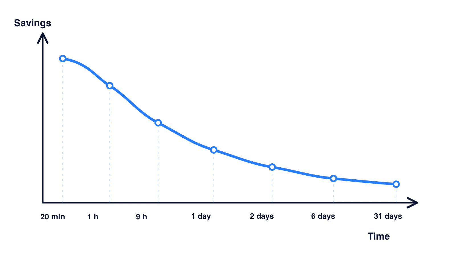
The exact amount forgotten is not portable. Will Thalheimer reviewed 69 conditions and found changes ranging from 0% to 94%; even within the 1-to-2-day window, results ranged from 0% to 73%. The material, prior knowledge, how it was learned, the delay, and the test all matter. A clean “50/70/90” schedule erases those conditions.
Meeting articles often take that schedule one step further and claim that “70% of decisions are forgotten within 24 hours.” No primary study supports it. Decisions are not nonsense syllables, and forgetting a detail is not the same as losing a team decision when it is recorded, assigned, and revisited.
The safe action does not need a fake deadline. Review the notes soon, while missing context is easy to restore. Confirm decisions and owners before the next handoff. Then use the record when the work resumes instead of trusting unaided recall.
Is handwriting better than typing?
Handwriting is not reliably better than typing; the more durable finding is that selecting and explaining ideas works better than copying them word for word.
Mueller and Oppenheimer's 2014 study became famous for reporting that laptop note-takers transcribed more verbatim and performed worse on conceptual questions than longhand note-takers. The proposed mechanism was plausible: handwriting is slower, so the writer has to choose and rephrase.
Later work weakened the medium-first headline. Urry and colleagues ran a direct replication with 142 participants and added a mini-meta-analysis of 8 studies in 2021. Their results did not support an immediate-learning advantage for longhand.
This does not make note-taking method irrelevant. It changes the useful question from “pen or keyboard?” to “what are you doing with the information?” A person who types a concise decision, its reason, and its owner is processing. A person who copies every sentence by hand can still avoid deciding what matters.
In a meeting, full transcription and thinking also compete for attention. Trying to capture every word yourself can pull you out of the discussion. Recording can handle the exact wording, while your attention stays on clarification, disagreement, and decisions. The result should still be reviewed; automation moves the capture burden, not the responsibility for checking the record.
What does this research mean for meeting notes?
Meeting notes work best as a small retrieval system: an exact record for verification, a concise written structure for action, one useful visual cue, and an early review.
- Capture the conversation without turning yourself into a stenographer. Use an approved recording method and tell participants when required. The goal is to stay present while preserving exact wording. For Meeting.ai, that record becomes a searchable, time-stamped transcript with Voice Match labels when speakers have been identified.
- Write the operational layer. Decisions, action items, owners, dates, open questions, and reasons need words. Meeting.ai's AI-Powered Summary organises these elements in the meeting's language, but a participant should still check consequential details against the transcript.
- Choose one visual trigger. A timeline can cue a project sequence. A flow can show a process. A comparison can separate options. A map can keep themes and relationships visible. The visual should answer a real question from the meeting, not decorate the notes.
- Revisit while repair is easy. There is no universal 24-hour retention percentage. Still, an early check has a practical advantage: participants can correct a name, owner, or condition before it reaches the next document or task system.
- Keep the layers connected. A visual without its source can oversimplify. A transcript without a summary is slow to scan. A summary without the transcript is harder to audit. Links between them let the reader move from cue to decision to exact words.
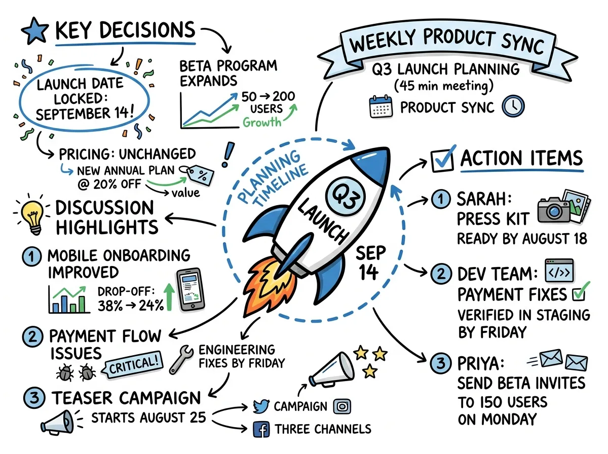
The image above is useful because its layout exposes grouping at a glance. It does not prove that anyone will remember 65% of the meeting. Its job is smaller and more practical: give the reader a recognisable route back into the discussion. Meeting.ai creates a Visual Note alongside the transcript and AI-Powered Summary, so the visual cue stays paired with searchable detail. You can see that three-part output on the meeting notes feature page.
Here is a focused review routine for a meeting owner:
- Scan the Visual Note and name the meeting's 3 main threads without looking at the summary.
- Open the AI-Powered Summary and check each decision, owner, and date.
- Follow the transcript timestamp for any disputed or high-risk point.
- Correct the record and send the relevant excerpt or follow-up, not a vague “please review the notes.”
- Return before the next related meeting and retrieve the prior decision rather than reopening the debate from memory.
That routine uses retrieval, active reconstruction, and source checking without pretending that one format fits every person. A finance review may need a table more than a radial map. A design critique may benefit from clustered examples. A legal discussion may depend on exact language. The best visual is the one that exposes the meeting's structure while leaving a path to the evidence.
What did we change in our own copy?
Meeting.ai removed the 65% retention line from its materials because we could not trace the number to an experiment that supports it.
We had repeated a familiar statistic from the same unsourced chain used across visual-note marketing. That was our mistake. This page now links to the studies behind the narrower claims we can defend, and it separates what a Visual Note can help with from what the evidence has never shown.
Use the Visual Note to orient the reader, the AI-Powered Summary to identify follow-up, and the transcript to verify exact words. None guarantees a retention percentage. Together, after a human checks consequential details, they make the meeting easier to revisit and act on.